You should spend about 20 minutes on this task.
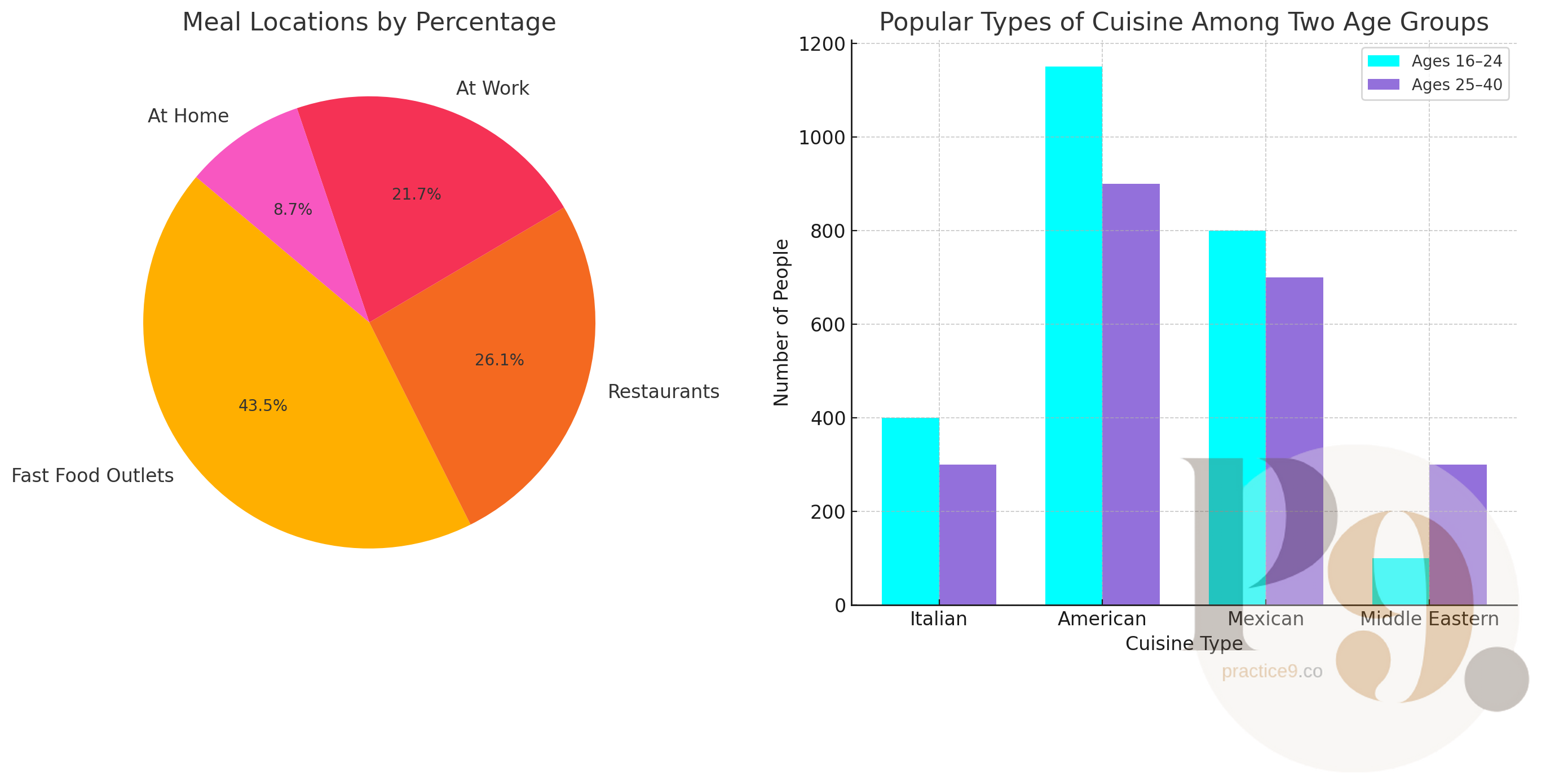
The pie chart displays data on where meals are typically consumed, including at home, at work, fast food outlets, and restaurants. The bar graph presents information on the preferred types of cuisine—Italian, American, Mexican, and Middle Eastern—among people aged 16–24 and 25–40.
Summarize the information by selecting and reporting the main features. You may make comparisons where relevant.
Write at least 150 words.